The Real Deal with World Maps: What Are Map Projections Explained, And Why Are They So Off?
Ever squinted at a world map and just thought, “Nah, that ain’t right?” Guess what? You are totally on the money, especially if you’re looking at the old-school flat ones we all grew up doodling on in class. These are the maps that literally baked our view of the planet into our brains since we were kids. Big spoiler: they’re typically way misleading. And understanding map projections explained isn’t just nerdy geography stuff; it’s about seeing how our own perceptions get twisted. Seriously.
Flat Maps (Like Mercator) Mess Up Country Sizes, Especially Up North
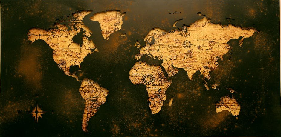
Think about most wall maps. Or even your standard Google Maps view. They pretty much use something like the Mercator projection. This is the map that somehow makes Greenland look almost as big as Africa. Insane, right? Go grab a globe. A real one. See Greenland? It’s about the size of your hand, maybe even smaller, compared to Africa’s epic sprawl. But on a flat-out Mercator map? They seem almost identical.
Here’s the straight dope: Africa’s actual landmass clocks in at a whopping 30.3 million square kilometers. Greenland? Just 2.16 million square kilometers. Whoa. That’s a 15-fold difference! So why do our maps shrink Africa and blow up places like Greenland? It’s simply how you take a round world and flatten the thing. We call ’em projections. And it’s no magic trick.
And another thing: this awesome website, TheTrueSize.com, gives you a live demo. You can literally drag countries around. Put Greenland over Africa. Poof—gone. Practically vanishes. Texas, for example, is almost turkey-sized. Australia covers pretty much all of Europe. Even Russia, which looks massive, is barely half the size of Africa. Mind officially blown.
Squishing a Round Globe onto a Flat Map? Impossible Without Distortion. Every Map is a Trade-Off
Okay, so the core problem: Earth’s a sphere. You can’t just peel an orange and lay its skin out perfectly flat without ripping or stretching it. Same exact deal with our planet. Taking a curved, 3D surface and trying to flawlessly slap it onto a flat sheet of paper. Impossible. Every single flat map? A compromise.
The math geek explanation calls it Gaussian curvature. A ball (sphere) has positive curvature. A flat table? Zero curvature. You simply cannot turn one into the other without some weird twisting and distorting. So, yeah. Every projection? Full of trade-offs. You nail one thing, you mess up another.
Early Maps Were Sketchy, Centered on Their World. Then Ptolemy Got Smart
Let’s rewind, say, a couple thousand years. People weren’t exactly jet-setting across continents. Trade? Risky business. An exotic affair. Because, frankly, nobody had a decent map. The world’s edges? Unknown. Other communities for trade or conquest? Mostly a total mystery. What they had were small, often inaccurate sketches. Just basic stuff.
But around 2,000 years back, Ptolemy, a brainy guy from Alexandria, tackled this monster problem: navigating vast distances. Folks knew Earth was round. But long trips weren’t common. Ptolemy’s big move? The meridian and parallel system. He hooked us up with the 360 meridians and 180 perpendicular parallels we still use. Numbers for every spot on Earth. Game-changer.
Early maps show this growing understanding. A map from 1482, supposedly the first to show Greenland and Iceland, tracked 8,000 points. Famously, though, it missed America—Columbus was still ten years out. Then came the Piri Reis map after Columbus’s finds, showing parts of Western Europe, West Africa, and even South America. By 1581, some maps were like a weird three-leaf clover—Europe, Asia, Africa, America tossed into a dinky leaf. And often, Jerusalem sat dead center. These weren’t “world maps” like we imagine. Just maps of human knowledge, limited viewpoints.
Different Maps Do Different Jobs: Mercator for Sailors, Gall-Peters for Area, Robinson for a Little Bit of Everything
The map you pick? Depends on what you need it for. For ages, the Mercator projection ruled. Especially for sailors. Why? It precisely locks down angles and directions. A straight line on that map meant a constant compass bearing. For ship captains trying to cross massive oceans, that was a huge deal. A lifesaver. This projection pretty much pictured a cylinder wrapped around the equator. Then the globe gets projected. Unroll it flat. Done.
But Mercator’s navigation smarts came with a big price tag: insane size distortions. Especially around the poles. Hence, Greenland’s massive ego. The result? Richer Northern countries suddenly looked way bigger. Poorer equatorial regions? Way smaller.
So, meet the Gall-Peters projection. This one focused on relative areas. Countries show up much closer to their actual size. shapes usually get stretched or squashed though. It’s been pushed as a “real map” or a fix for Mercator’s hidden biases. But it’s got its own set of weirdness. The shapes are pretty funky.
Then we have the Robinson projection. This one isn’t trying to perfectly keep area, angle, or distance true. Instead, it’s all about finding a solid balance. It tries to minimize overall distortion across all three. Visually, it just looks right. Because it gives a good general feel for the continents without any huge flaws, it often gets chosen as a standard world map. Want a map that just looks good and mostly accurate? Robinson is a solid choice.
Map Choices Aren’t Just Lines: They Affect How We See Power
Look, it’s more than just ink on paper. How we see the world really affects how we think about it. For generations, maps like Mercator subtly, powerfully, made richer, developed nations in the North seem dominant, bigger, more important. Meanwhile, countries near the equator, often less developed, shrink in visual impact. This ain’t just a map quirk; it carries historical and socio-political baggage. It shapes stories and biases about global power.
Realizing Maps Lie Makes You Smarter About Everything Else
Once you get that every single map is someone’s take on the world, things change. It’s actually a really powerful lesson in critical thinking. Our visual guides? Not always telling the whole truth. And that goes way beyond geography. It makes you poke at other “facts” you see. You start digging for the real story, the context, different perspectives. The world doesn’t just show up to us. We build it, visually, in how we choose to show it.
The ‘Orange Peel Problem’ Has a Math Name: Gaussian Curvature
Remember that orange peel? The real math reason it’s impossible is Gaussian curvature. It’s a number. Tells you how curved a surface is at any spot. A sphere curves in every direction; positive curvature. A flat table? Zero curvature everywhere. You can bend and twist a sphere all you want, but you cannot mold its positive curvature into the zero curvature of flatness without some serious—and visually messed-up—stretching or tearing. That’s why there are so many different kinds of map projections. Each one with its own weirdness and compromises.
Frequently Asked Questions
Why do standard flat maps make some countries look much bigger than they are?
Standard flat maps, like the Mercator projection. They really distort landmass sizes. Especially way up north or down south. Because, pure math. You can’t perfectly represent a 3D sphere on a 2D plane. To make lines of longitude look parallel (super useful for sailing), areas near the poles get stretched out like crazy.
Which map projection is the “most accurate” for seeing the true sizes of countries?
No single map projection is truly “accurate” in every way. The Robinson projection is often a solid pick for general use. It’s a good compromise. Less distortion overall in terms of area, shape, and distance. Just looks balanced. For actual area accuracy, the Gall-Peters projection tries to save true land mass sizes. But the shapes get really wonky.
How did early cartographers manage to navigate long distances without accurate world maps?
Early sailing was tough. Really tough. Simple local maps or basic charts were common. But bright folks like the ancient Greek cartographer Ptolemy developed vital systems. Things like meridians and parallels. That gave them a grid. Numerical coordinates for locations, making long trips more systematic. Even if perfect global maps hadn’t even been dreamed up yet.